One Dashboard, Not Five Tools: Why Businesses Consolidate
Scattered tools cost more than their subscriptions. Here is what the real bill looks like and how consolidation actually works.
Scattered tools cost more than their subscriptions. They cost the time and the errors of moving data between them, and that bill is usually several times larger than the invoices. One dashboard that pulls the important numbers into a single view removes most of that tax.
This is not an argument against using several tools. Specialist software is usually better at its job than an all in one platform. The problem is not that you run five tools. It is that nobody can see across them without opening five tabs and doing arithmetic by hand.
What do scattered tools actually cost?
Double entry. The same customer, order, or job typed into two or three systems. Every keystroke is a chance to be wrong, and every correction later costs more than the original entry did.
Reconciliation. Somebody exports, matches, and compiles. In most businesses this is a weekly ritual nobody has ever measured, and it is often a full working day disguised as normal work.
Disagreement. Two systems produce two numbers for the same thing, so meetings begin with an argument about which is correct rather than what to do. That is the most expensive symptom, because it slows decisions.
Delay. The picture is always a few days old. Decisions get made on last week's numbers, or not made at all.
Blind spots. Nothing shows the connection between tools. A job marked complete in one system and unpaid in another sits invisible until someone stumbles across it.
Onboarding. Every new employee has to learn five interfaces and five sets of jargon to do one job.
Add those up and the subscription line stops being the interesting number.
What does consolidation actually mean?
Two different things, and confusing them is why consolidation projects fail.
Replacing tools. Move everything into one platform. Fewer systems, one bill, but you inherit that platform's opinions everywhere, and migration is painful. Sometimes right, usually disruptive.
Consolidating the view. Keep the specialist tools your team already knows, and build one screen that reads from all of them and shows the operational picture in one place. Nobody changes how they work, and the tax disappears.
For most businesses the second path is the better trade. Your accounting software is good at accounting. The problem was never the software, it was that nothing joined the pieces together.
What belongs on one dashboard?
A dashboard exists to support decisions, not to display everything you own. If a number would not change what someone does today, it does not belong on the main screen.
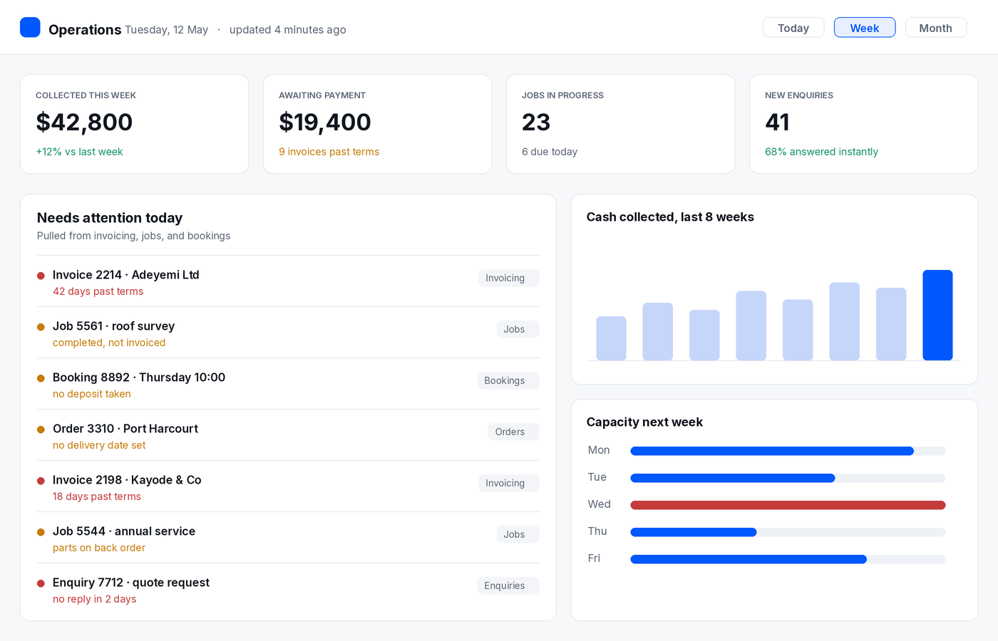
A useful operational dashboard usually shows: money in and out for the period, work in progress and what stage it is at, exceptions that need a human today, capacity or availability for the coming week, and two or three leading indicators such as enquiries received or conversion rate.
Exceptions matter most and are almost always missing. Unpaid invoices past terms, jobs completed but not invoiced, orders with no delivery date, bookings with no deposit. A screen that surfaces those every morning pays for itself faster than any chart.
What that looks like
Why definitions matter more than charts
The hard part of a dashboard is never the graphs. It is agreeing what the words mean.
Is revenue booked or collected? Does a lead count when the form is submitted or when it is qualified? Is a job complete when the work is done or when it is invoiced? Does a refund reduce this month or the month of the original sale?
Until those are settled in writing, every number on the screen is arguable, and people will keep going back to their own spreadsheets. Settling definitions is the real work of consolidation, and it usually surfaces disagreements that were quietly costing money already.
How do you build it without a six month project?
Step one, inventory. List every system holding operational data, who uses it, and what only it knows.
Step two, pick the decisions. Name the five decisions the business makes weekly. Those decide what the dashboard shows. Everything else is noise.
Step three, write the definitions. One line per metric, agreed by whoever argues about them today.
Step four, read only first. Pull data in and display it. No editing, no writing back. This is fast, low risk, and it exposes data problems before they are expensive.
Step five, fix at source. The first version always reveals bad data. Fix it where it lives rather than papering over it in the dashboard.
Step six, add actions later. Once people trust the view, adding actions such as marking a job invoiced or chasing a payment from the same screen turns it from a report into a working tool.
When is consolidation the wrong move?
When you run two tools and a spreadsheet. The task is real but small, and a weekly export costs less than a build
When the underlying data is unreliable. A dashboard on top of bad records produces confident nonsense faster.
When nobody will own it. Dashboards need a person responsible for definitions and accuracy, or they quietly rot and people go back to exports.
And when the true problem is process rather than visibility. If jobs are late because the schedule is chaotic, showing the chaos on a screen does not fix it.
Signs you are ready
Someone compiles a weekly report by hand. Two systems disagree and nobody knows which is right. Your team opens four tabs to answer one customer question. Invoices are missed because completion and billing live in different places. Or you cannot answer a simple question about this week without asking someone to check.
If three of those are true, the tax is already larger than the build.
The quieter point
Consolidation is not about having fewer tools. It is about having one place where the state of the business is visible without anyone assembling it by hand.
Get the next one by email
Reporting, reviews, and guides on AI and automation, sent as they publish. No sequences.